
WMW ADVERTISING AGENCY
GERMANY | IN-HOUSE & FREELANCE ART DIRECTOR

As Art Director at the advertising agency WMW, and now as a freelance creative partner, I have had the opportunity to collaborate with talented people on a wide range of projects. The following selection highlights work shaped by shared ideas, thoughtful design, and a commitment to creating meaningful brand experiences.
UNSER BÜRGERBRÄU
BRAND REFRESHMENT
CAMPAIGN
PACKAGING
A well-established regional brewery was ready for its next chapter. The challenge was to refresh the Unser Bürgerbräu brand by modernising the visual identity of its flagship beers, GUSTL Hell and GUSTL Zwickl, while preserving the authenticity and loyalty of its existing audience. The redesign bridges heritage and contemporary culture, creating a stronger, more distinctive presence for a new generation of beer lovers.
At the heart of the refresh is GUSTL himself. Inspired by the brewery’s founder, the character was reimagined as a hand-drawn portrait and transformed into a unique brand asset. The identity extends across packaging, campaign visuals and communications, anchored by the Bavarian tagline “GUSTL auf a Hoibe?”—a local expression that turns the brand name into a warm invitation to share a beer.


ABLINGER + EC RED BULL SALZBURG
DIGITAL & PRINT
CAMPAIGN
BRAND COLLAB
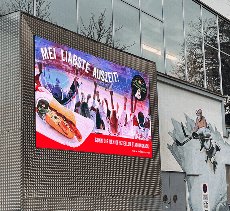
A campaign celebrating the partnership between Ablinger and EC Red Bull Salzburg, bringing together two local brands through a shared passion for sport, food and community. The challenge was to create a visual identity for the collaboration that captured the energy of game day while positioning Ablinger as an integral part of the arena experience.
The concept was developed as a flexible campaign system across stadium graphics, LED fascia boards and digital communications. Designed to perform at every scale, the visuals created a consistent presence throughout the arena, reinforcing the partnership wherever fans came together.



3FF ENERGY
DIGITAL & PRINT
BRAND IDENTITY
MOTION GRAPHICS
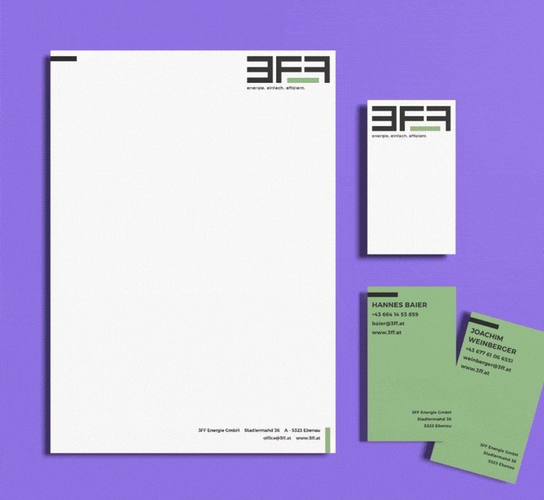
For 3FF Energy, the goal was to create a brand identity that communicates efficiency, expertise and innovation in a clear and approachable way. Complex energy solutions were translated into a modern visual language that builds trust with both industry professionals and everyday customers.
A distinctive identity system was developed across logo, colour palette, typography, business communication and digital experiences. Custom illustrations replaced generic imagery, making technical topics more engaging and accessible while creating a unique and recognisable brand presence.


ENERGIE-KRAFT SÜD is a regional provider of photovoltaic systems, battery storage and EV charging solutions. The campaign shifted the conversation from technology to everyday benefits—lower energy costs, greater independence and the freedom to enjoy life. Benefit-led headlines such as "Sonne rein, Koffer raus" ("Sun in. Suitcase out.") and "Sonne tanken, Gipfel stürmen" ("Recharge in the sun. Conquer the summit.") transformed technical solutions into relatable, human stories.
A bold visual language and optimistic colour palette were applied across print, outdoor media, vehicle graphics and direct mail, creating a cohesive campaign that made renewable energy feel accessible, relevant and inspiring.
ENERGIE-KRAFT SÜD
CREATIVE CONCEPT
BRAND IDENTITY
CAMPAIGN
PRINT & OUTDOOR


EURIM PHARM
EXHIBITION DESIGN
SPATIAL BRANDING
CONCEPT
BRAND EXPERIENCE
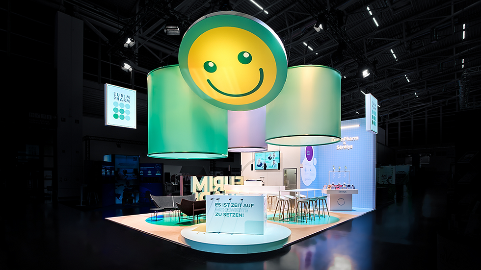
For EurimPharm, one of Germany's leading pharmaceutical companies, an exhibition concept was developed for Expopharm, Europe's largest pharmaceutical trade fair. Designed as a flexible brand experience, the modular stand evolved each year around a new theme while maintaining a consistent visual identity.
From interactive visitor experiences to the company's 50th anniversary installation, every element was designed to encourage conversation, strengthen brand perception and create memorable moments. Developed in close collaboration with the client and exhibition partner, the result was a cohesive spatial identity that transformed the stand into a destination rather than simply a display.


To celebrate its 50th anniversary, EurimPharm commissioned a campaign that honours its heritage while looking towards the future. Under the guiding idea “EurimPharm setzt Impulse” (“EurimPharm creates impulses”), the concept highlights the company’s pioneering role in the pharmaceutical market and its continued drive for innovation.
A distinctive visual system was developed around a dedicated anniversary logo, combining established brand elements with fresh graphic expressions. Across print, digital media, film and interactive formats, the campaign created a consistent brand experience—transforming five decades of history into a forward-looking story.
EURIM PHARM 50 YEARS
DIGITAL & PRINT
CAMPAIGN
BRAND EXPERIENCE


HAGER CIVIL ENGINEERING
EDITORIAL DESIGN
MAGAZINE
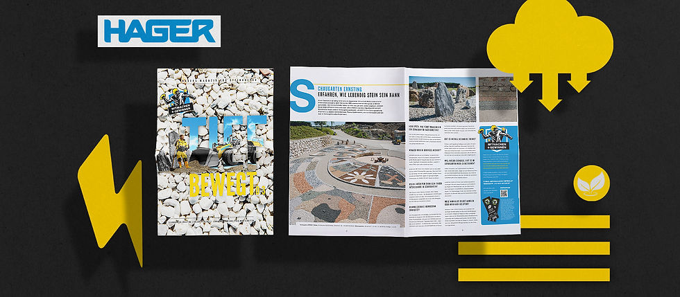
The HAGER magazine translates the expertise of a civil engineering company into a clear and engaging editorial experience. Through thoughtful structure, strong visuals and purposeful storytelling, it communicates HAGER’s projects, values and commitment to innovation and sustainability.
A carefully crafted publication that transforms complex topics into accessible stories while strengthening the brand’s identity and future-focused vision.


BERGFRISCH
MARKETING TOOLS
BRAND EXPERIENCE

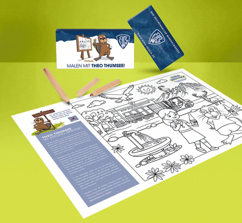

For BERGFRISCH (Mountain Fresh), the goal was to extend the brand experience beyond traditional campaigns and create meaningful touchpoints in everyday life. Through thoughtfully designed marketing tools, regional storytelling and high-quality materials, the brand becomes tangible—authentic, approachable and deeply connected to its origins in Bad Reichenhall.
From sustainable kids’ activities and lifestyle products to targeted newsletters, every element was designed to strengthen the relationship between brand and audience. A consistent visual language turns everyday interactions into memorable BERGFRISCH experiences.
WOHNSTIFT MOZART
DIGITAL EXPERIENCE
CONCEPT
WEB DESIGN

For Wohnstift Mozart, a premium retirement residence, the website was designed around the guiding promise “Wo mein Glück zuhause ist” (“Where my happiness feels at home”). Tailored to the needs of prospective residents and their families, the digital experience combines intuitive navigation, elegant design and thoughtful storytelling to create trust while reflecting the comfort, independence and quality of life the residence offers.
A warm and spacious visual language, supported by large imagery, refined typography and clear content structures, creates an accessible and emotional experience. The design puts people at the centre—communicating a sense of belonging, security and a place to truly feel at home.

